User Interface
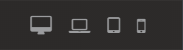
Responsive View Controls
Open/Close Various Panels

Undo/Redo Last undoable actions

Preview Project

Save/Publish Project

Logout From Architect

Breadcrumbs. Click to select an element.

Elements
#Introduction
You can see all the elements that come with Architect by default on the left sidebar (elements panel), they can be basic ones like button or link or they can be a lot more complex and combine html markup, css styling and javascript behaviour into one element.
#Drag and Drop
You can drag and drop elements from the elements panel into the builder. Note that you might not be able to drop them anywhere you like, because architect follows official HTML5 specification for what elements accept what elements as children, for example an unordered list element (ul) will only accept list item (li) as a child, so you will only be able to drag and drop list items inside unordered list.
#Creating new elements
You can create your own elements, to accompany the default ones, here how to do so.
First create a new file inside elements folder, you should name it after your element, so for example if want to name your element My awesome element, the file name should be:
myAwesomeElement.html
Then inside the file, describe your new element. You can do this in 3 parts:
- Add any css you need for your element inside
<style></style>tags at the top of the file. You should add<style></style>tags even if your element doesn't require any custom css to avoid problems. - Add your element html markup after the style tag.
- And finally add your element configuration after html markup, inside
<script></script>tags.
| Name | Type | Default | Description |
|---|---|---|---|
| Name | String | Generic | Name of your element. Uppercase and spaces allowed. |
| Nodes | Array|String | undefined | Either an array of nodes your element is matched by or '*', meaning all nodes (your element will be matched by class). |
| Frameworks | Array | undefined | This doesn't do much at the moment, but will be used in the future when architect supported mupltiple frameworks. |
| Class | String | undefined | A class your element will be matched by, can be empty if you specified a node instead. |
| Types | Array | ['flow'] | An array of element types (html categories), you can find them here. |
| validChildren | Array|false | ['flow'] | An array of types (html categories) that your element accepts as children. you can the categories here. |
| Category | String | undefined | What category in elements panel your element should appear under (typography, forms, components etc). |
| previewScale | String | 1 | You can specify the ratio you want to shrink your element on in the preview in elements panel if it doesn't fit otherwise. |
| showWysiwyg | Boolean | true | Whether or not a text editor should be show when your element is double clicked. |
| hiddenClasses | Array | undefined | Array of classes you want to be hidden in the inspector class editor. |
| canDrag | Boolean | true | Whether or not the element should be draggable in the builder. |
| canModify | Array | all | An array of styles that should be modifiable from the inspector (padding, margin, borders etc) |
| Attributes | Object | Undefined | This is where you can specific javascript config behaviour for your element in the inspector. The object should contain keyd objects where name is selects or input fields name and value is a config object. You can look at some examples in assets/js/builder/definitions/bootstrap.js or base.js Here is an example for text input element that allows to change placeholder attribute value: placeholder: {
list: [
{name: 'Text', value: 'text'},
{name: 'Password', value: 'password'},
],
text: true,
value: 'Text input',
onAssign: function($scope) {
this.value = $scope.selected.node.getAttribute('placeholder');
},
onChange: function($scope, text) {
$scope.selected.node.setAttribute('placeholder', text);
$scope.repositionBox('select');
}
},
list: An array of objects that represent select options, where value is option value and name is option name. text: specifies whether it should be an input field or a select. If this is false your should specify a list instead. value: default value for select or input field. onAssign: Callback for then this config field is innitiated (when your element is selected in the builder), good place to set a default value as seen above. onChange: Callback for then this config value is changed, you get passed $scope on which you can access the selected node in the builder and the new value as a second parameter. |
#Inspector
The panel on builder right is called an inspector, using the inspector you can modify various css styles for a selected element without any css knowledge while having real-time preview in the builder.
Element visibily
The buttons at the top of inspector control selected element's visibility on on phone, tablet, laptop and dekstop. If the buttons background is black the selected element will be hidden on that device. This helps building truly responsive pages.

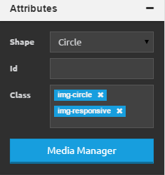
Attributes
Attributes section of inspector will contain:
- Float - This is basically same as aligning text left/center/right, but for elements instead of text.
- Id - A unique id for selected element, so css cap be applied easier to it.
- Class - All the selected element classes will be listed here, you can remove them by clicking the x icon next to class name, you can apply new custom classes to an element by clicking anywhere on the input (gray background), entering your class name and hiting enter or clicking green check mark. There are a bunch of predefined class that you can use, for example text-danger will make the text color red. You can find more predefined classes here.
This section will also have various other attributes depending on what element you have selected, for example, if you have a heading selected it will have a heading type attribute, so you can choose between h1, h2, h3, h4, h5, h6.

Background
Background section will allow you to set a background image, color or gradient for a selected element.
Color
Click on the color button to bring up a color picker. Here you can choose from over a 100 different predefined popular colors from adobule kuller and other sites. You can ofcourse select a completely custom color by dragging your mouse in the color paletter and selecting a transparancy with a dragger underneath, you can also enter a color code in the input below.

Image
Click on the image button to bring up an image background panel, here you can apply one of over 40 textures included with architect and control the backgroun image alignment and repeating. You can also click on media manager icon to bring up the media manager to upload and use a custom image or select an already uploaded image. More on media manager here.

Gradient
Click on the gradient button to bring up a gradient panel, here you can choose from over 30 css3 gradients included with architect to use as selected element's background.

Shadows
You can use shadows panel to apply css shadows to selected element or to text inside it.
- Angle - to control shadows angle, click on the green knob in the circle and drag it around.
- Color - to control shadows color, click on the white square, this will bring up a color picker, same as the one for elements background color.
- Distance - this will control how far away the shadow will be from selected element.
- Blur - this will control how clear the shadow is.
- Spread - this will control how big the shadow is.
- Box/Textthis will apply the shadow to either the element box or text inside it.
- Innter/Outterthis will either apply shodow to the outside or inside of selected element box.

Margin / Padding
Margin controls the spacing between selected elements box and the content outside, while padding controls the spacing between selected elements border and the content inside it.
To use the dragger, first select the sides you want to apply margin or padding to and then drag the handle until you have your desired effect. For a more precise control you can enter your margin and padding values in the input boxes, big one will apply the value to all sides while the smaller ones represet a particalar side of elements box.

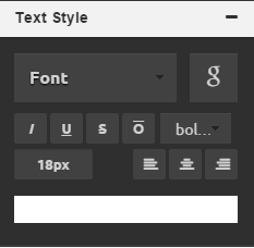
Text Style
This panel controls the appearence of selected elements text.
Font
Click on the font select, to change selected elements font to one of the native browser fonts, or click the G icon to open up google fonts modal, so you can choose from one of nearly 700 google fonts.
Style
Click on of the buttons under the fonts to change text boldness or make it italic, underlines, overlined or crossed-out.
Size, color, alignment
You can change text size by entering desired number in the input box, you can click one of the alignment options to align text left, center or right or you can change text color by clicking on the square at the bottom of the panel to bring up a color picker.
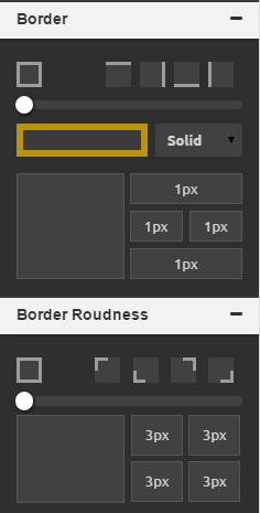
Border / Border Roundness
In the last two panels you can control the selected elements border appearence and it's corners roundness.
Width, color and style
To change border width and color first select the border sides you want to change at the top and then either use the dragger or input boxes at the bottom to get the disired effect. To change border color click on the square under the dragger to bring up a color picker.
Roundness
To change border roundness, first apply the border you want via the border panel, then select the corners you want to change at the top and use the dragger or enter the value you want in the input boxes.
#Image Editor
Note that image editor will only work on images that are accessible from internet, meaning it will not work when working locally with something like wamp or mamp.
To open image editor, select an image element in the builder and click the pencil icon.

Once image editor is open you can selet a modification/addition you want to make from the top, once you are done simply click save button in the top right corner and the changes will be instantly applied in the builder.

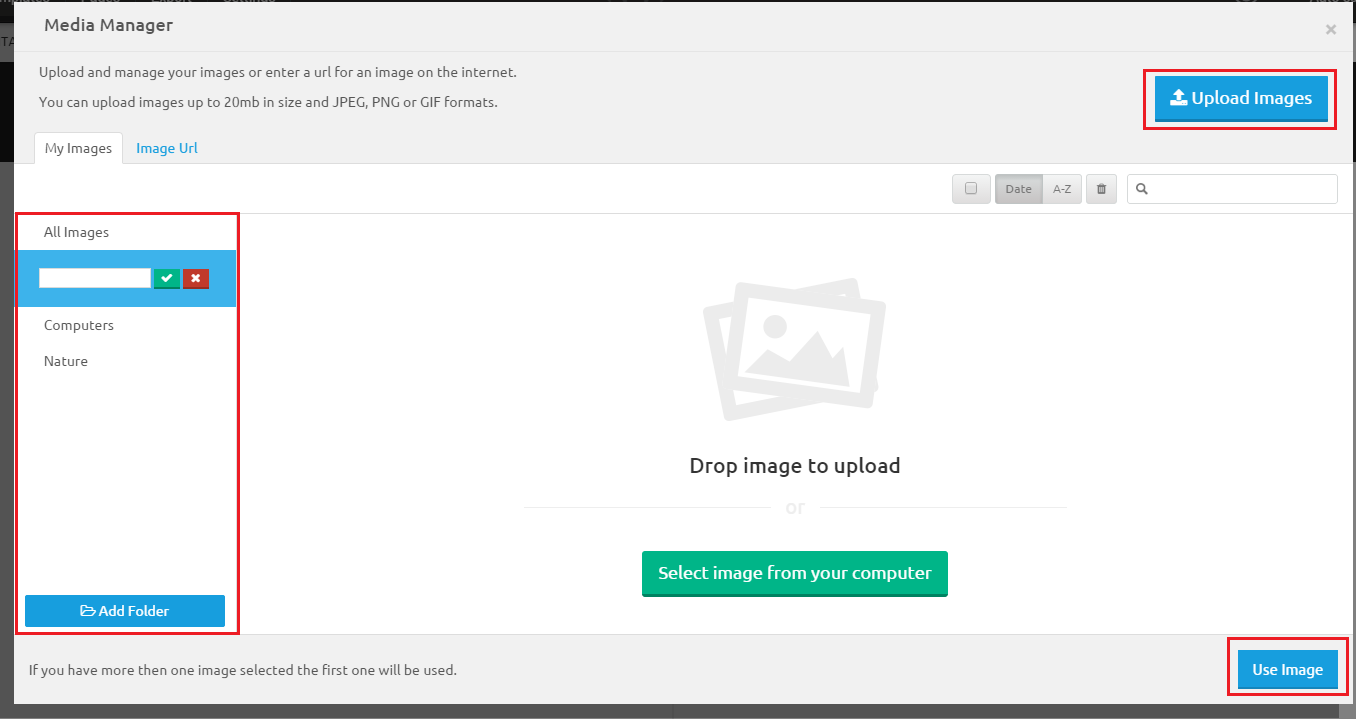
#Media Manager
To open media manager either select an image element in the builder or click on image button in the inspector and then click blue Media Manager buton.
Folders
In the My Images tab, you can create/edit and delete folders. You can use these folders to organize your images, once an image is uploaded to a folder it will not be visible in other ones.
Uploading
To upload a new image drag it onto the manager or click the blue Upload Images button in the top right corner.
Using images
To use an image(s) simply select the ones you want and click Use button at the bottom right corner, how images will be used depends on how the media manager was opened, for example, if you opened it from the attributes panel in inspector the selected image will replace the one currently selected in the builder.
#WYSIWYG Editor
To open a wysiwyg editor double-click on any element in the builder that contains text contents.
Editing Text
Once editor is open you can edit/delete and write new text in there as in any other text editor.
Changing Styles
To change text font family, size or styling, simply select the text you want to apply these styles to with your mouse and then click the relevant style icon in the wysiwyg bar.

Wrapping text in a link
To wrap text in a link, simply select text you want to wrap with the mouse and click icon, then enter the url you want and click Go.

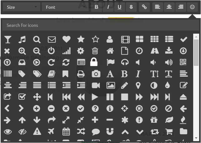
Icon Manager
To insert an icon, position the carrot where you want to insert the icon, click the smiley face icon in the wysiwyg bar, find the icon you want and click on it.
#Code Editors
For a full control of your project you can use code editors at the bottom to edit your html, css and javascript and see a live preview of your changes.
HTML Editor
Click on the Html button at the bottom to bring up an html editor, here you can edit your projects html and see a live preview of your changes in the builder. Selecting a new element in the builder will highlight that element's markup in the html editor, you can also click view source in the right-click menu to show selected elements markup in the html editor.

CSS Editor
In the css editor you have full control of your project css, css generated by inspector as well as your custom one will be visible here, you can edit, delete or add custom css all with a live preview in the builder and warning/error message to help you write correct syntax.

JS Editor
In the js editor you can edit your projects javascript as well as attach external libraries for your project to use, like google maps, animated scrols and rss feeds. To attach/detach a library simply click on it on the right. To add a new library click on the plus sign in the top right, this will bring a new library modal, simply enter the library details and clikc Save & Close

Themes
#Introduction
Themes will completely change your project styling like colors, fonts, borders, spacing etc. There are 17 pre-made themes included with Architect, you can of course create your own.
#Changing a theme
To change your active theme click on themes in the top navigation bar, this will open a themes panel. You can select a new theme by clicking on it's image on the left and you can see a preview of your active page with a new theme on the right.

#Creating a New Theme
To create a new theme, open themes panel and click on Create New at the bottom. This will open a Theme Creator panel.
Variables
A theme consists of variables, for example a button will have @btn-primary-bg and @btn-primary-border variables, values of these variables will define what the background color and the border color of primary buttons.
Panel
To create your theme, simply select a variable cateogry from the left, enter new values for the variables you want in the middle and check if you like your new change on the preview panel on the right.
Custom Less
For full control of your theme, you can click on Custom Less button at the bottom to open the panel and enter any custom less you want, less is basically an improved version of css, you can enter css here if you want or you can learn some less here.
Saving
To save your new theme, simply enter your themes name, select the type and click save at the bottom, note that it might take a while to save the theme so don't close the Architect while you dind't get confirmation what theme was saved successfully.

Templates
#Introduction
Templates are complete and fully featured multi-page designs for various types of sites like landing page, blog, portfolio etc. Once you apply a template to your project you can just change some text and you will have a fully made website in no time. There are currently 9 pre-made templates included with Architect with more to come in future updates. You can ofcourse create your own.
#Choosing a Template
You can select a template when creating a new project or you can apply it to an active project by clicking on templates in the top navigation bar, this will open a templates panel. You can preview a template by clicking on it's image on the left and you can apply a template to your project by clicking use at the bottom, please note that all of you projects previous html, css and js will be erased when new template is applied.
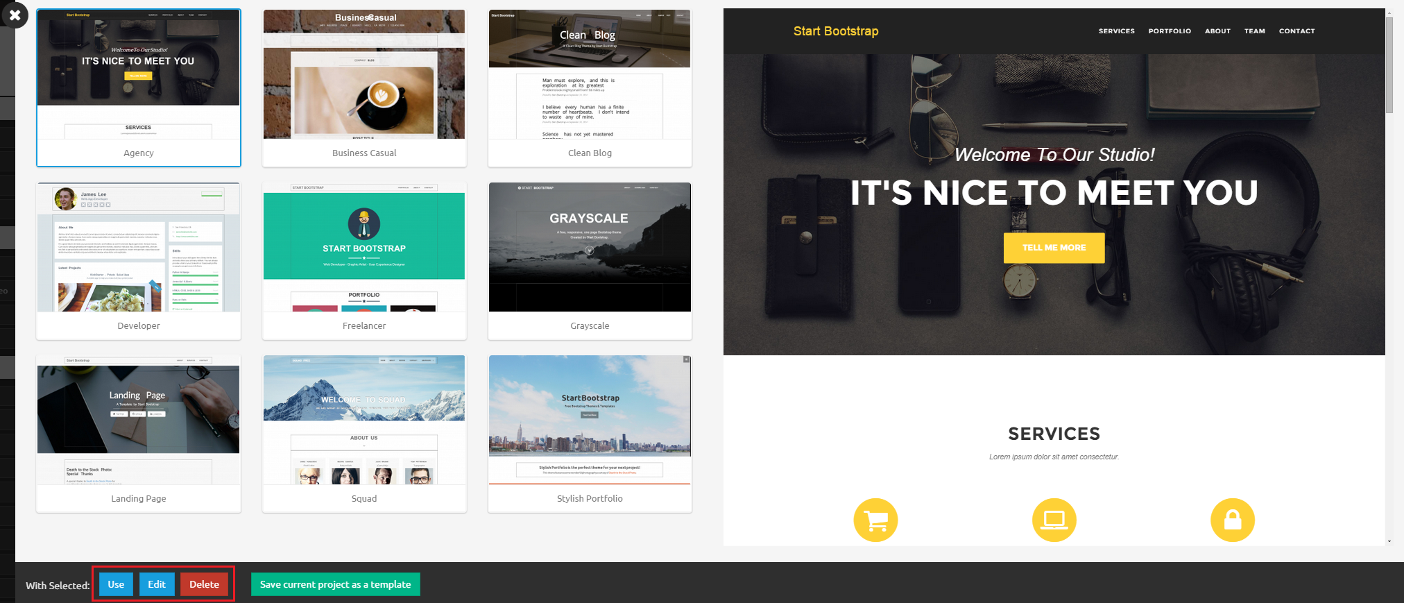
#Creating a New Template
To create a new template, open templates panel and click on Save current project as a template at the bottom. This will open a modal, where you can enter your templates name, category and primary color. Once you click Save & Close your new template will be saved using your current projects css, html and js.

Pages
#Introduction
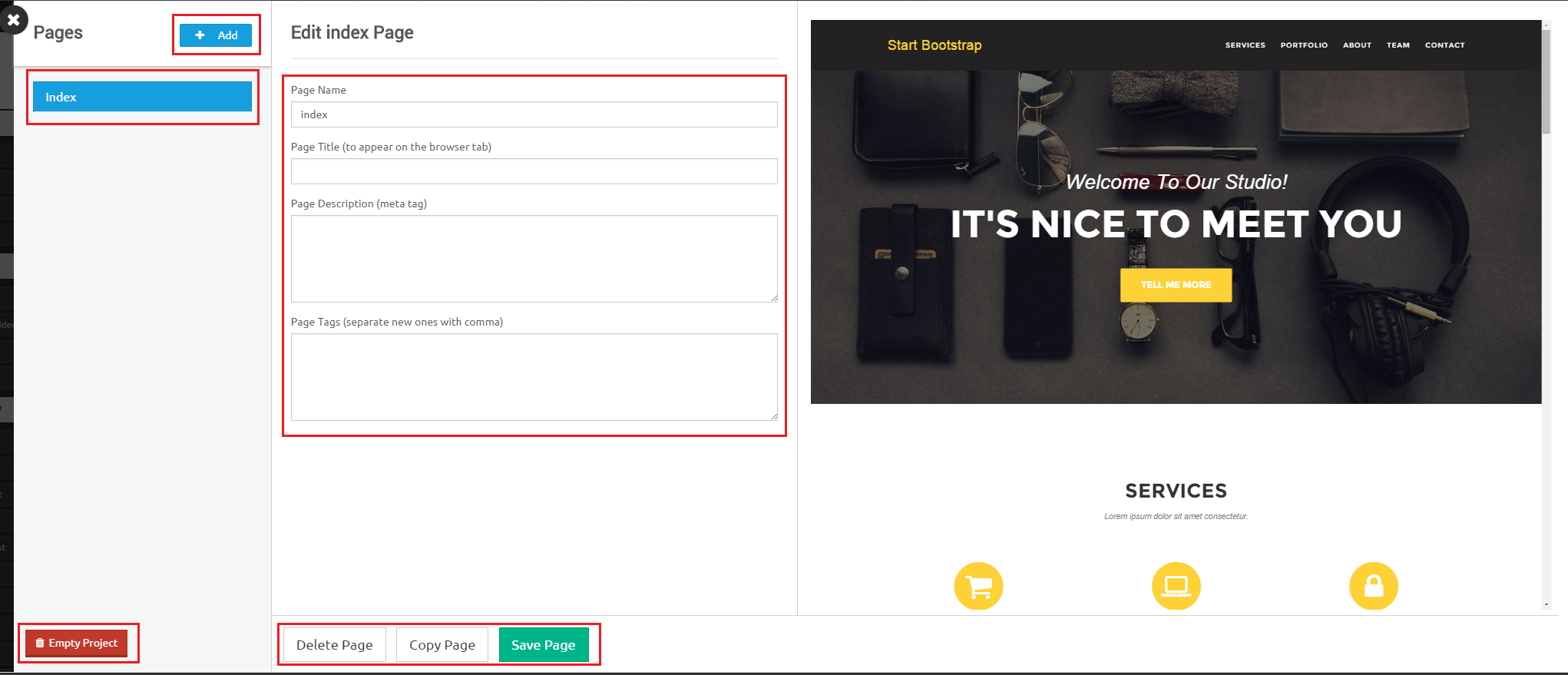
Your project can have more then one page, you can manage your project pages by clicking pages on the top navigation bar, this will open a pages panel.
Adding a New Page
You can create a new page by click add new button at the top of pages panel. This will create an empty page.
Switching Pages
Clicking on the page names on the left will switch the pages, so you can change their names and meta data as well as change the active page in the builder.
Emptying Project
Clicking on red Empty Project button at the bottom will clear all html, css and javascript for all the project pages. So you can start with blank pages.
Name and Meta
You can change the page name, title, description and tags in the middle of pages panel, these meta tags will be applied to the pages when they are exported.
Delete, Copy, Save
You can delete a page, copy it or save any changes you have made at the bottom of pages panel.
#Export / Publish
You can easily download your full project as a .zip file containing production ready code or you can directly export it to a remote server via ftp.
Downloading a project, page or an image
To download a project, click on the Export button on the navigation bar, this will open exports panel. From here, you can click images on the left side to download them, you can copy&pase or click copy to clipboard button to copy your projects html and css. You can click export project button at the bottom to download the whole project or you can instead select a page and only download that page.

Publishing a project
To publish a project, click on the publish button at the top right on the navigation bar while in the builder or the cloud icon in the dashboard, this will open publish modal, here, simply enter your ftp credentials, the folder on your server you want the project to be uploaded to and check the SSL box if you want to use a secure connection, then simply click publish. Note that this proccess might take a minute or two depending on connection speed, so don't close the browser or architect tab until upload is done.

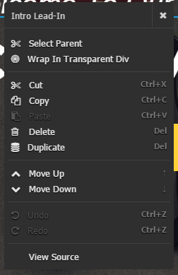
#Context Menu
To open context menu right click anywhere in the builder. The menu will contain some extra options depending on that element your cursor is hovering over, for example, if open menu while hovering over table it will have options to add and remove table rows and columns. Here are the options context menu will always have:
- Select Parent - This will select currently selected elements parent node in the builder.
- Wrap In Transparent Div - This will wrap the selected element with transparent black background.
- Cut, Copy, Paste, Delete, Duplicate - Will perform these operations on a selected element.
- Move Up, Move Down - Move selected element up or down in the builder, usefull when you need more precision for positioning then drag & drop can provide.
- Undo, Redo - Undo or Redo the last undoable action in the builder.
- View Source - Open html editor and highligh the markup for selected element.
#Keybinds
If keybinds are not working you might need to click anywhere inside the builder to focus the main window.
| Keybind | Description |
|---|---|
| ↑ | Move selected element up in builder |
| ↓ | Move selected element down in builder |
| Del | Delete selected element from builder |
| Ctrl + C | Copy selected element |
| Ctrl + V | Paste selected element |
| Ctrl + X | Cut selected element |
#Settings
To open settings panel click on settings button on the navigation bar. Here you can change various builder settings by choosing yes or no, these settings will be saved in the local storage so they will persist after page reloads.
